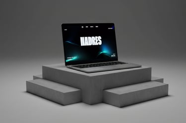
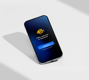
AQUANECE

TIMEFRAME
2025
PROJECT
CATEGORY
PRODUCTION TIME
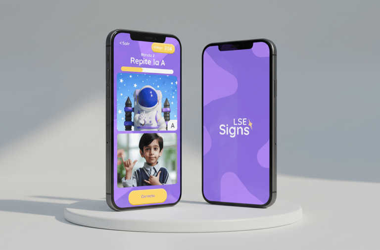
Mobile App
UX/UI
2 weeks
Designed a playful, gamified mobile prototype that helps users reduce social media use by promoting mindful focus through visual rewards and gentle interventions
DEFINING THE CHALLENGE
Problem statement
Most social platforms use addictive design patterns — infinite scroll, push notifications, and gamified feedback loops — that hijack attention and make users lose track of time.
The goal is to help people regain control over their mobile usage through simple, respectful, and effective tools that support autonomy rather than impose restrictionsa
Design and validate a mobile prototype in Figma that helps users reduce time spent on social media and increase awareness of their habits promoting self-regulation and mindful use through gentle interventions.
Role
I led the research, interaction design, and usability testing. From running competitive benchmarks and user interviews to building wireframes and lo-fi prototypes in Figma, I focused on validating core features and shaping a design that feels mindful, engaging, and genuinely centered on the user.
Goal
RESEARCH
Secondary Research (Competitive Benchmark)
I analyzed apps for digital wellbeing, focusing on app blocking, usage limits, and productivity tools. Competitors offer features like Focus/Sleep modes, Pomodoro timers, gamification, and cross-device support.
Key insights: simple, intuitive design matters, effectiveness is boosted by metrics or gamification, and multi-device availability is a major advantage.
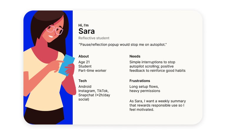
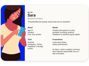
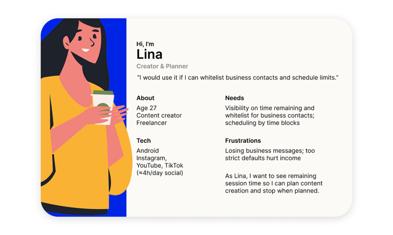
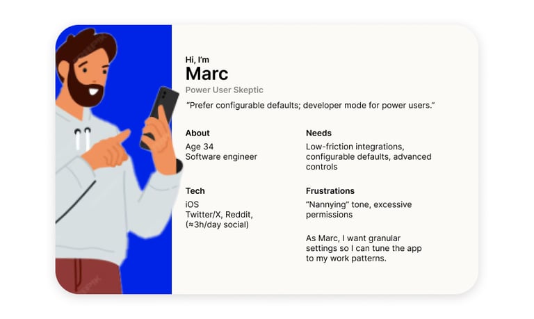
Primary Research (User Interviews)
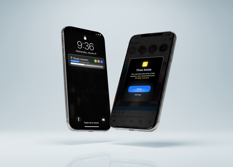
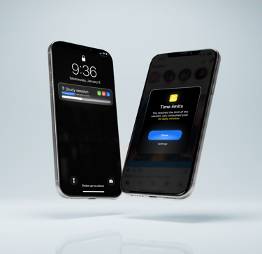
We interviewed social app users (18–34) to validate features, asking about likes, confusions, behavior change, and long-term use. Main takeaways: visible time countdowns, pause/reflection popups, and notification management are highly valued, while customization and respectful tone improve adoption.
Key insights
"Pause/reflection popups stop autopilot behavior"
Participant 3 · Student
"Time countdown & weekly summary help users plan"
Participant 2 · Marketing professional
Participant 5 · Content creator
"Quick mute and notification grouping are top features"
PROBLEM & GOAL
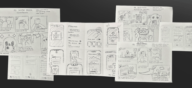
Design Exploration & Storyboarding
Used How Might We (HMW) prompts and a Crazy 8s sketching session to explore multiple approaches for reducing autopilot scrolling and increasing mindful use.
Ideas were ranked by impact vs. feasibility, then translated into three storyboards — one for the overall context (daily phone use), and one for key screens (session setup and reflection popup).
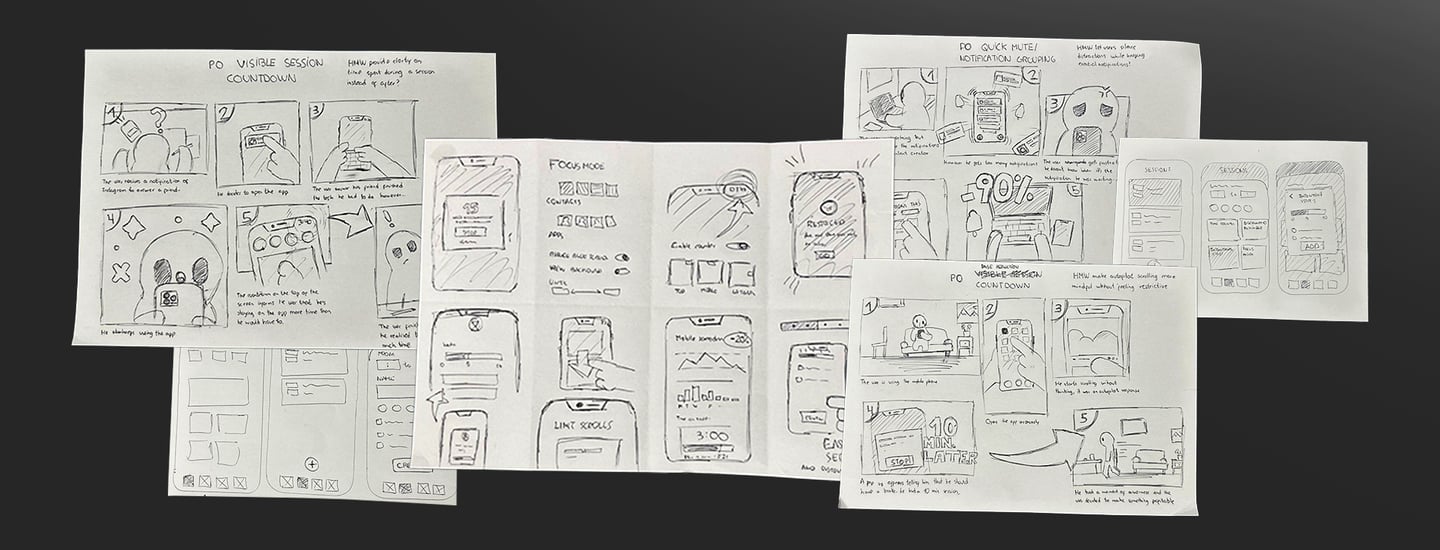
Concept Development
After ideation, I developed three core concepts and two storyboards that evolved into the “Fish Tank” prototype — a gamified wellbeing app that rewards digital focus with visual progress.
Outcome
The ideation process shaped a concept that replaces restriction with motivation, framing digital wellbeing as a playful, rewarding challenge rather than a limitation.
LO-FI PROTOTYPE & ITERATION
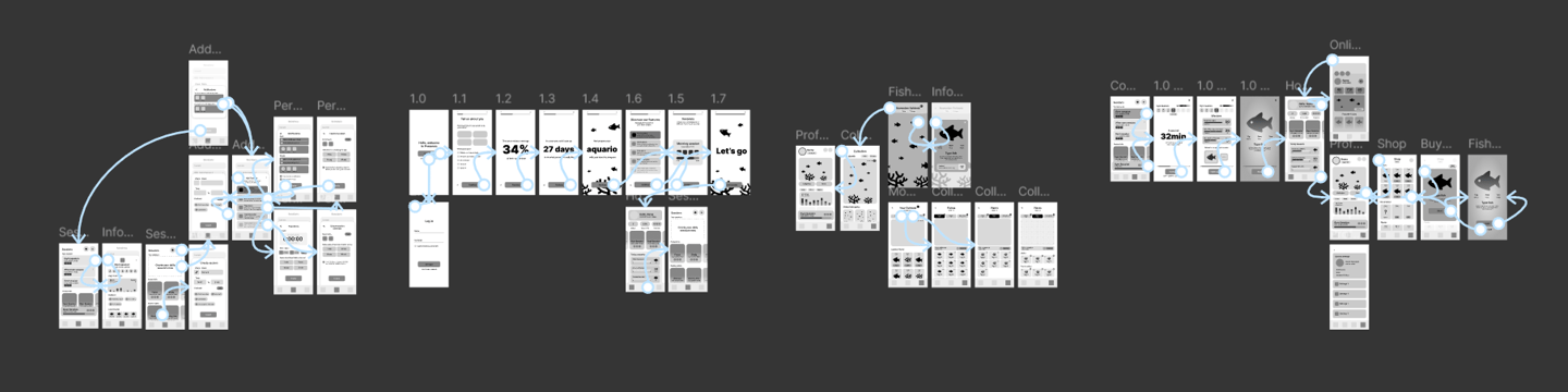
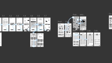
Wireframes & Lo-Fi Prototype
I analyzed apps for digital wellbeing, focusing on app blocking, usage limits, and productivity tools. Competitors offer features like Focus/Sleep modes, Pomodoro timers, gamification, and cross-device support.
Key insights: simple, intuitive design matters, effectiveness is boosted by metrics or gamification, and multi-device availability is a major advantage.
Usability Testing
A moderated usability test with three target users helped assess comprehension and friction across onboarding, session setup, rewards, and aquarium customization. Most participants completed key tasks with minimal guidance. Insights showed that users easily understood the session concept and countdown logic but needed clearer feedback in filters and rewards. Improvements focused on simplifying labels, surfacing key actions, and clarifying gamification rewards.
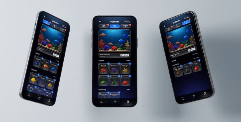
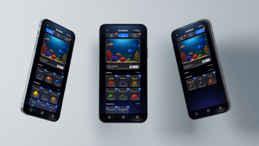
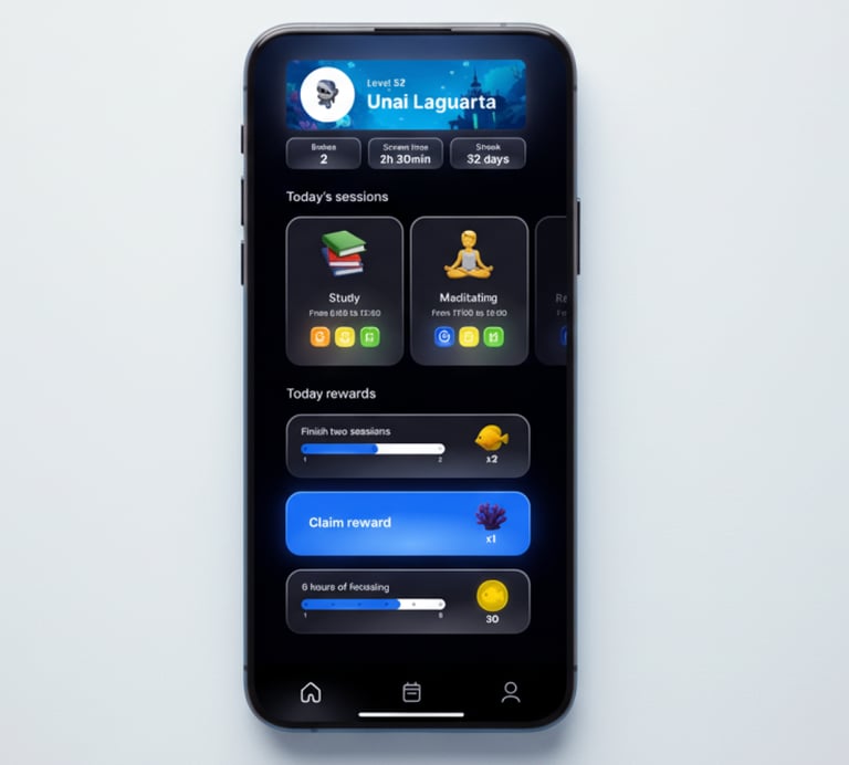
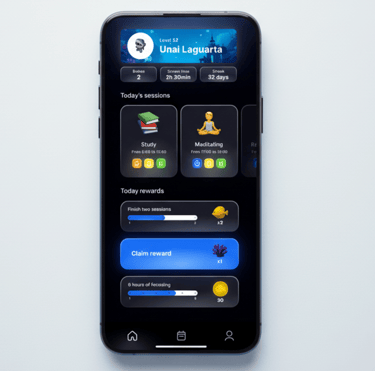
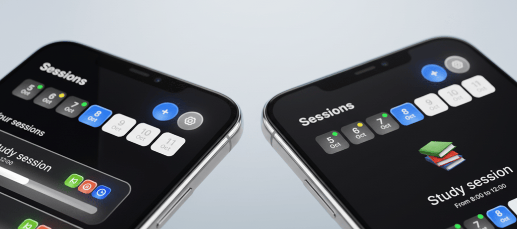
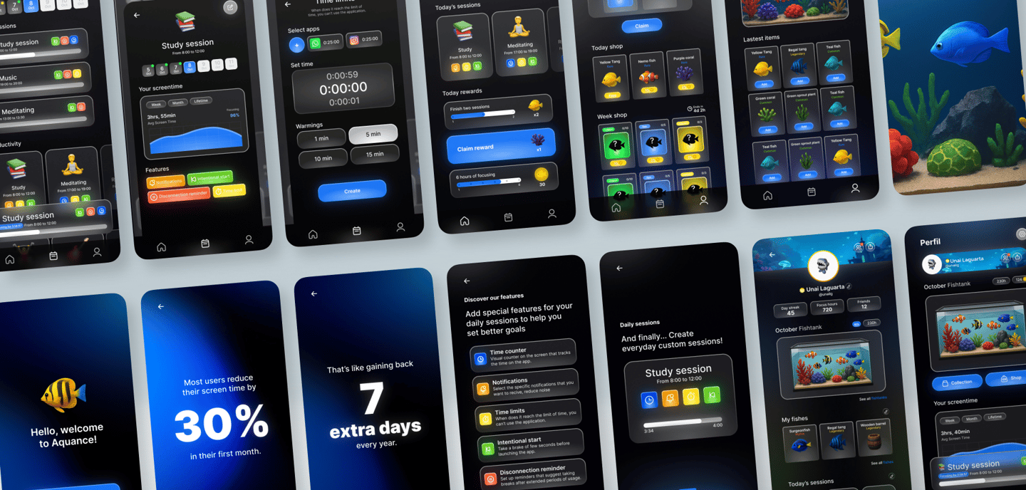
HI-FI PROTOTYPE
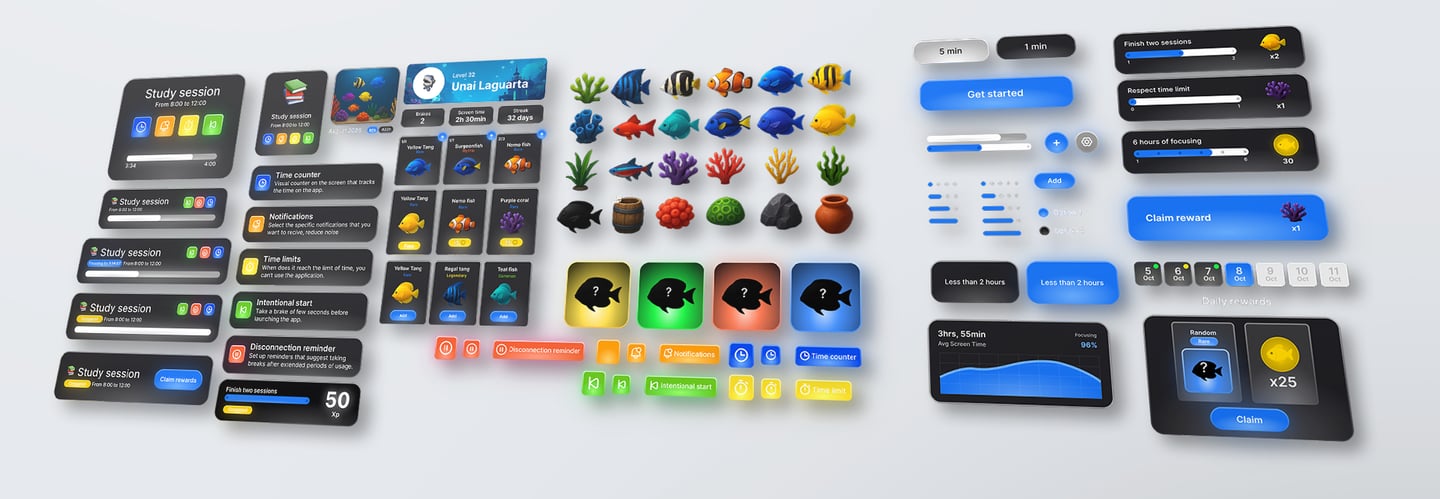
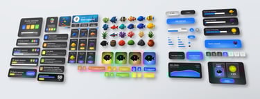
Design System
I developed a comprehensive Design System to establish the visual identity and interaction language of the app. It included a cohesive set of components — buttons, icons, color palette, typography, and layout patterns — ensuring consistency and scalability across screens. I also designed the full gallery of collectible species and decorations, defining their styles, states, and animations. This system became the foundation for creating a unified, intuitive experience and a visually distinctive brand.
High-Fidelity Prototype
In the High-Fidelity Prototype stage, I applied the design system to create polished, visually consistent screens that reflected the app’s identity. Building on insights from the low-fidelity tests, I refined layouts, interactions, and flows to improve clarity and engagement.
Explore the interactive prototype in Figma
CONCLUSION
Results
This project allowed me to apply everything I learned from the Google UX course — from doing proper research, defining user personas and journeys, to building empathy maps and testing ideas through iteration. I’m proud of the final prototype, not only because it looks great, but because it reflects a real understanding of user needs.
During the process, the idea of gamifying the experience completely changed my approach: creating an evolving aquarium that visually rewards users made the concept both more engaging and meaningful.
Learnings
At first, I didn’t realize how important it was to focus on every part of the research process — from defining personas and journeys to empathy maps, interviews, and the problem statement. But going through all these steps helped me truly understand what users need and how they think. Empathizing with them became the key to designing a meaningful experience. Conducting those first interviews gave me valuable insights that shaped the following stages — from wireframes to the final high-fidelity prototype — and taught me to be more critical and intentional with every design decision.