SIGNS

TIMEFRAME
2025
PROJECT
CATEGORY
PRODUCTION TIME
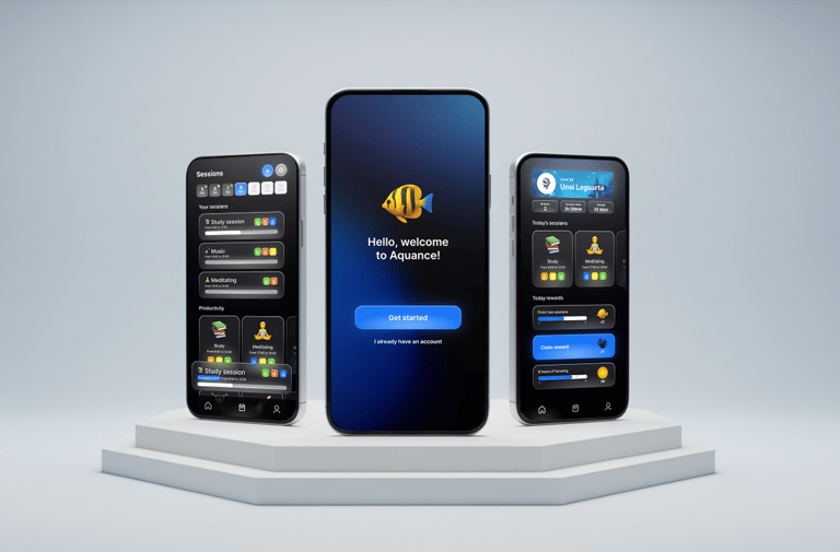
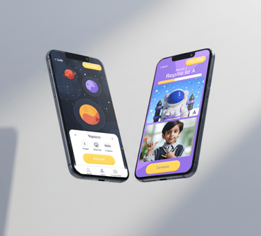
Mobile App
UX/UI + Development
3 months
A mobile application that teaches Spanish Sign Language (LSE) to children aged 3–10 through interactive mini‑games, all wrapped in a space‑exploration narrative.
DEFINING THE CHALLENGE
Problem statement
Existing tools for learning Spanish Sign Language (LSE) are often text-based, static, or aimed at older audiences. For younger children, this makes sign language learning feel distant and unengaging. Our challenge was to design a mobile app that turns early LSE learning into an interactive, visual, and playful experience—one that feels as natural as playing a game, while still supporting real educational value.
Goal
Our goal was to create an engaging and inclusive platform that teaches the 30 letters of the LSE alphabet through short, rewarding lessons. Using gamified mechanics, bright visuals, and accessible interaction patterns, we aimed to make learning sign language both fun and approachable for kids aged 3–10, whether playing solo or with friends in multiplayer “rooms.”
Role
This project was developed collaboratively by a team of four. My role focused on designing the user experience and user interface, defining navigation flows, and crafting the visual identity. I also contributed to implementing several screens in React Native to ensure a smooth transition from prototype to code. Other teammates specialized in 3D modeling and animation, as well as full integration and backend development.
RESEARCH
To understand how to make sign language learning fun and accessible for children, we began with a literature review on gamified education for early childhood and analyzed existing apps such as Duolingo, ASLKids, Lingvano, and PocketSign. We found that short, goal-oriented activities improve retention, while visual feedback like progress bars and badges boosts motivation. Combining 3D-animated avatars with real-video demonstrations proved to be the most effective approach for balancing play and learning. We also interviewed parents and educators to identify key needs—simple navigation, positive reinforcement, and inclusivity—helping us shape an experience that’s both educational and genuinely enjoyable for young learners.
UX PROCESS
User Research & Insights
We developed two primary personas—Lucía, a 6-year-old learner who thrives on quick feedback and playful visuals, and Marta, a teacher who values clarity and structured progression. Their empathy maps helped us understand motivations, frustrations, and daily contexts, allowing us to design features that balanced fun with learning efficiency.
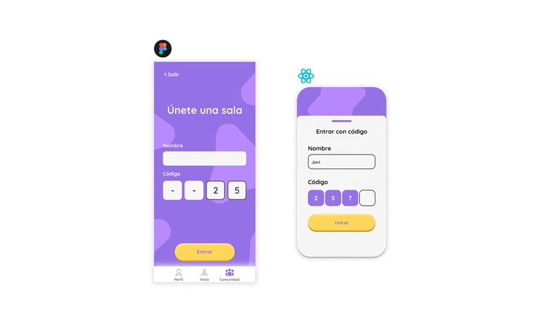
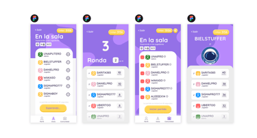
Information Architecture & User Flows
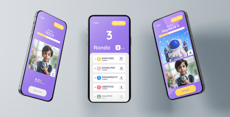
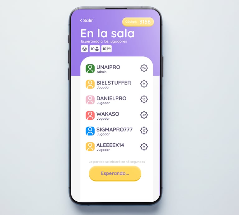
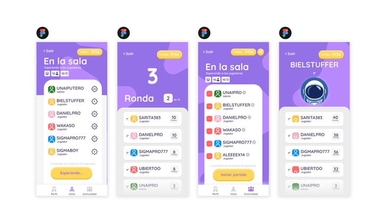
Using these insights, we structured the app around a simple three-step loop: Explore Worlds → Play Lesson → Review & Share. This kept navigation predictable while supporting both solo and multiplayer experiences. Each screen was designed to minimize cognitive load—clear iconography, short text blocks, and a consistent hierarchy helped maintain focus without overwhelming young users.
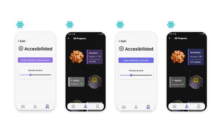
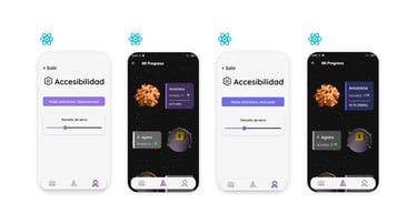
Accessibility Considerations
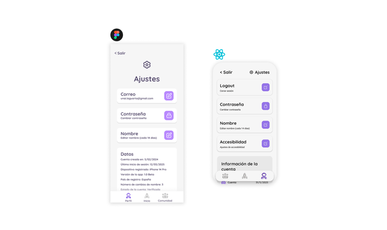
Designing for children meant paying special attention to accessibility and inclusivity. We implemented large touch targets, clear visual contrasts, and rounded typography for readability. Adjustable text size, color-blind modes, and optional audio guidance made the app usable for diverse learners. Beyond compliance, our goal was to create an environment that feels welcoming, easy to navigate, and empowering for every child—regardless of ability or learning style.
HI-FI PROTOTYPE
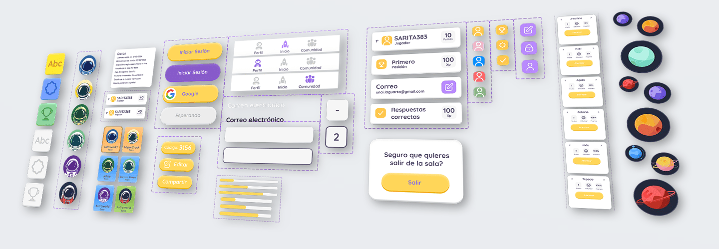
Design System
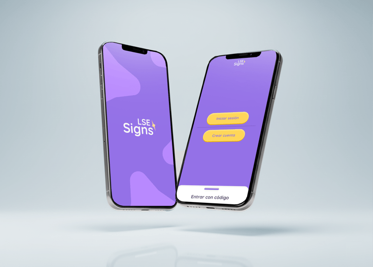
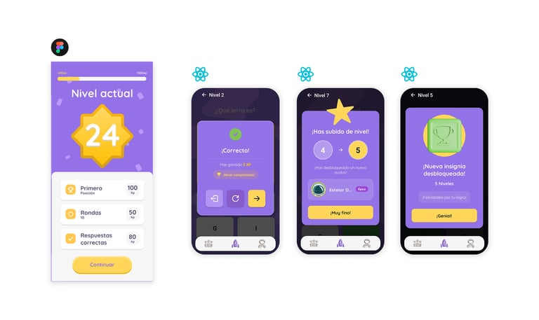
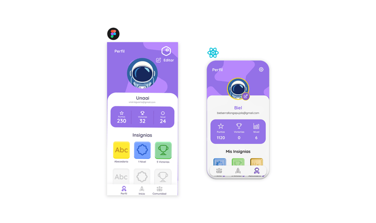
Our design system was built to ensure visual consistency and emotional warmth throughout the experience. Using Quicksand as the main typeface and a color palette combining bright yellows with deep purples, we created a look that felt both playful and clear. Components such as buttons, cards, badges, and progress bars were built with Auto-Layout for flexible scalability and coherence across screens. Every element—rounded corners, smooth shadows, and gentle animations—was designed to feel approachable for young users, while maintaining a strong visual identity that ties the whole product together.
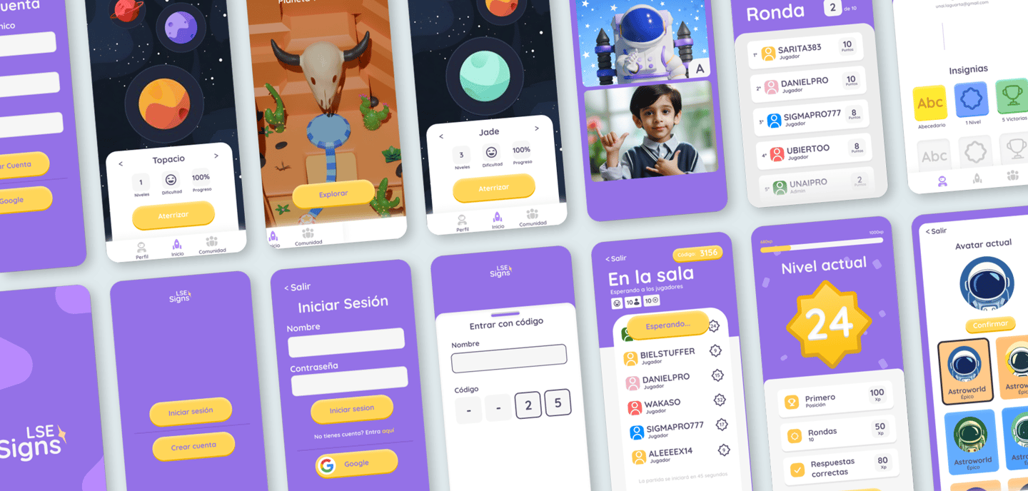
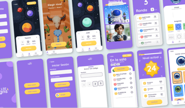
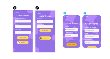
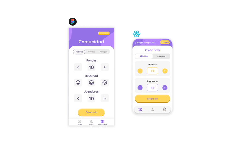
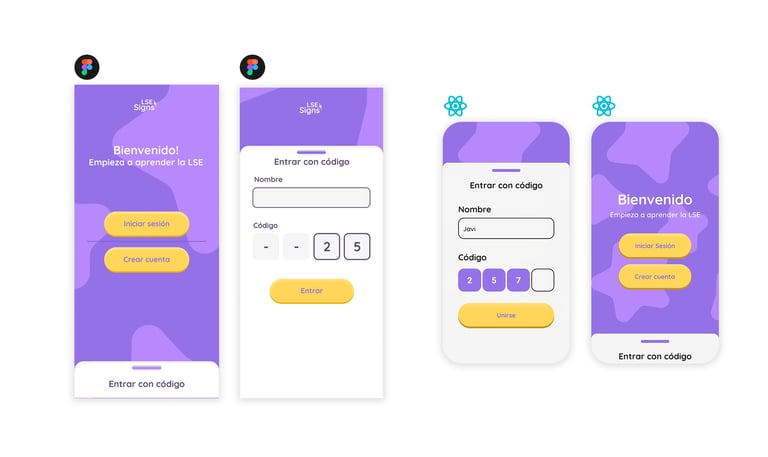
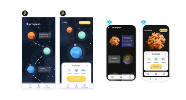
High-Fidelity Prototype
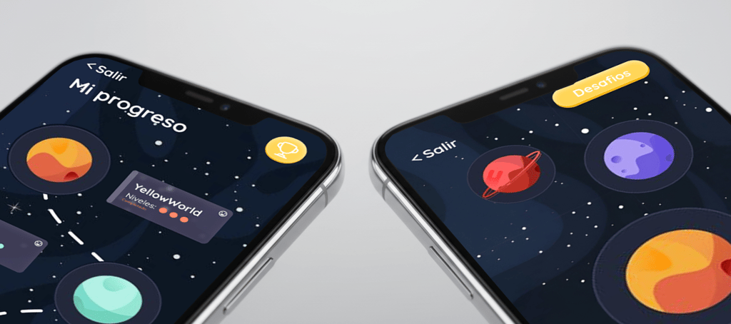
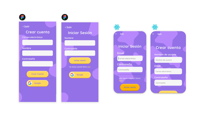
The high-fidelity prototype was fully built in Figma, reflecting both the final visuals and interactive behavior of the app. We simulated the main user journeys—from exploring planets to completing lessons and earning badges—while integrating transitions that mimic the app’s real navigation logic in React Native. Each screen was designed to guide users smoothly through the learning experience, balancing animation and functionality without compromising accessibility or performance.
Explore the interactive prototype in Figma
DEVELOPMENT & TECHNOLOGY
App architecture
Signs is built in React Native, using a hybrid Stack & Tab navigation pattern to seamlessly guide users between onboarding, world‑selection, lessons and social rooms. We rely on React Hooks (useState, useEffect) for local state and the Context API for global state—tracking user progress, current game session data and UI theme preferences—ensuring smooth, responsive performance across both iOS and Android devices.
Backend
Our backend is powered by Supabase, which provides instant PostgreSQL storage and real‑time subscriptions. We utilize Supabase Auth for email/password, Google OAuth and guest‑mode logins, and store user profiles, progress metrics, room states and avatar selections in structured tables. Real‑time listeners drive live multiplayer updates, while role‑based Row Level Security ensures data privacy.
3d assets & multimedia
We created a library of optimized 3D assets—rigged astronaut models animated for each of the 30 LSE letters and pre‑rendered planet scenes—exported as lightweight GIFs and WebP files to ensure quick load times. These assets are integrated via Lottie animations and WebGL placeholders within the React Native app, bringing rich, interactive visuals to young learners without sacrificing performance or increasing bundle size.


CONCLUSION
Results
This project allowed me to apply everything I learned from the Google UX course — from doing proper research, defining user personas and journeys, to building empathy maps and testing ideas through iteration. I’m proud of the final prototype, not only because it looks great, but because it reflects a real understanding of user needs.
During the process, the idea of gamifying the experience completely changed my approach: creating an evolving aquarium that visually rewards users made the concept both more engaging and meaningful.
Learnings
Working in a four-person team taught me the importance of clear communication between design and development, especially when defining how components should behave once coded. I learned to organize tasks more efficiently, streamline feedback cycles, and adapt when facing technical constraints—particularly React Native’s limitations with 3D assets. This experience strengthened my ability to bridge design intent with real-world implementation, ensuring that creative ideas remain functional and achievable.