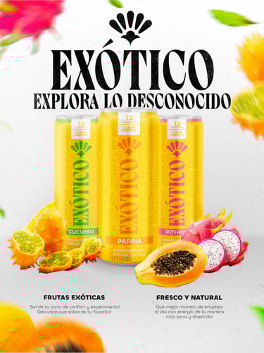
EXÓTICO

TIMEFRAME
2023
PROJECT
CATEGORY
PRODUCTION TIME
Brand, Visual Identity, App
Branding
2 months
Exótico is an energy drink brand inspired by tropical flavors, blending creativity and freshness. I designed its full visual identity, packaging, and a mobile app for a creative audience.
OVERVIEW
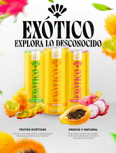
Exòtic is an energy drink brand inspired by the vibrant colors and flavors of tropical fruits. The identity revolves around yellow — a symbol of joy, energy, and creativity — complemented by tones of papaya, pitaya, and cucumis. Its visual language combines bold geometric shapes with organic curves, capturing a sense of movement and adventure. Designed for a daring, creative audience, Exòtic brings a fresh perspective to what energy means.
DEFINING THE CHALLENGE
Problem statement
The energy drink market is saturated with brands that feel repetitive, overly aggressive, and disconnected from authenticity. There was a need for a product that felt more natural, creative, and emotionally engaging.
Goal
To create a distinctive energy drink brand that merges tropical flavor with visual storytelling. The aim was to design a cohesive identity that embodies creativity, adventure, and freshness.
Role
As the designer, I developed the entire visual ecosystem of Exòtic: the brand identity, logo, packaging design, and a mobile app that expands the experience beyond the product itself.
NAMEING & SLOGAN
Name
The name Exòtic comes from the essence of its tropical fruit flavors, all originally from Mexico. Keeping the name in Spanish preserves its roots while adding a touch of authenticity and exclusivity. It instantly evokes freshness, nature, and curiosity.
Slogan
The slogan “Explore the Unknown” reinforces the brand’s adventurous spirit — an invitation to step outside routine and discover something new, bold, and full of energy.
BRAND ECOSYSTEM
Exòtic speaks to a creative, adventurous, and bold audience — people who enjoy stepping out of their comfort zone and exploring new experiences. Its users are designers, entrepreneurs, and curious individuals seeking products that feel fresh, natural, and unique.
The brand lives across multiple touchpoints: vibrant packaging, posters, social media, and a dedicated mobile app. Every interaction is designed to reflect the brand’s energy and adventurous spirit, creating an emotional connection while inspiring exploration and discovery in everyday life.
VISUAL IDENTITY
Typography
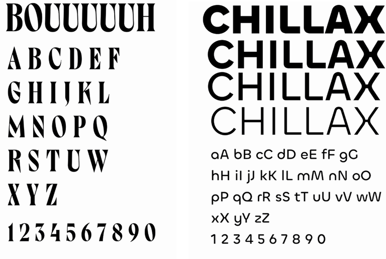
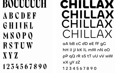
For Exòtic, the fonts “Bouuuuuh” and “Steinbeck” were chosen for their bold, expressive, and modern personality. They convey energy and creativity while remaining highly legible, reflecting the playful and adventurous spirit of the brand.
Color Palette
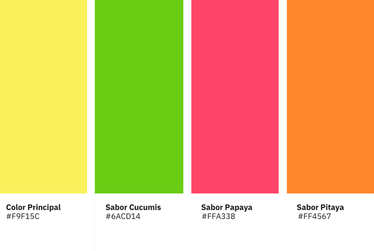
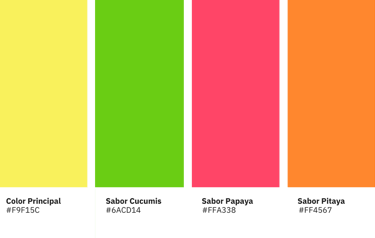
The primary color is yellow symbolizing joy, energy, and optimism. Secondary colors are inspired by the fruits themselves: green for cucumis, orange for papaya, and red for pitaya. Each hue supports recognition of the flavor while keeping the overall visual system vibrant and consistent, reinforcing freshness and creativity.
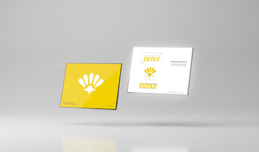
Logo Concept
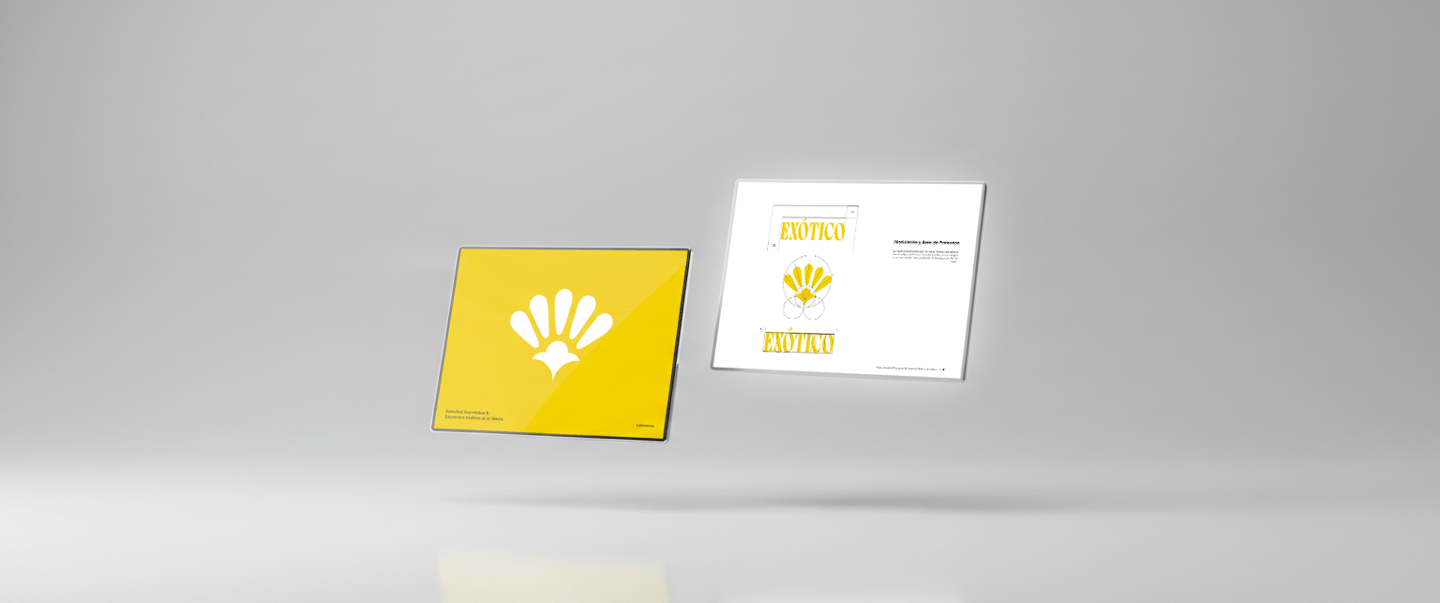
The logo takes inspiration from Mexican papel picado, a traditional paper craft, connecting the brand to its cultural roots. Its central figure resembles a fruit seed, while the five surrounding shapes hint at the mesocarp, creating a versatile symbol that adapts to multiple flavors. The overall design also evokes a tropical flower, reflecting the natural and exotic essence of the brand.
Shapes and Meaning
Triangles communicate energy, order, and dynamism, reinforcing the brand’s adventurous character, while organic forms emphasize naturalness and trust, linking the visual identity to the product’s authentic fruit origins. Curves introduce movement, positivity, and playfulness, creating a sense of rhythm and approachability in both packaging and digital applications.
Together, these elements form a cohesive visual system that balances boldness with warmth, guiding the audience’s perception while remaining flexible across different touchpoints.
PACKAGING DESIGN
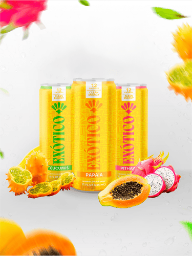
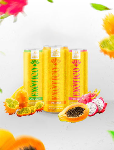
Each Exòtic can reflects the unique flavor it contains, combining vibrant colors with bold, playful forms. Cucumis is green, fresh and energizing, highlighting naturalness and vitality. Papaya is orange, warm and joyful, evoking tropical sweetness and fun. Pitaya is red, bold and exotic, inspiring curiosity and adventure. The packaging balances simplicity and expressiveness, using geometric shapes, organic curves, and the tropical flower motif from the logo.


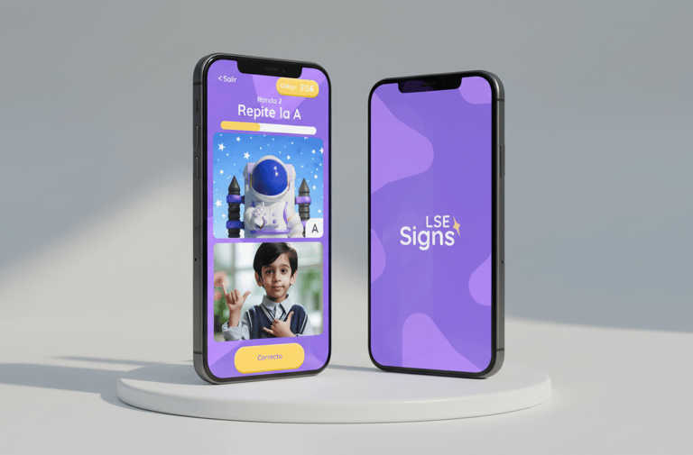
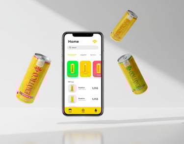
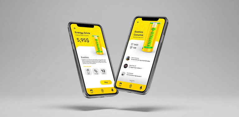
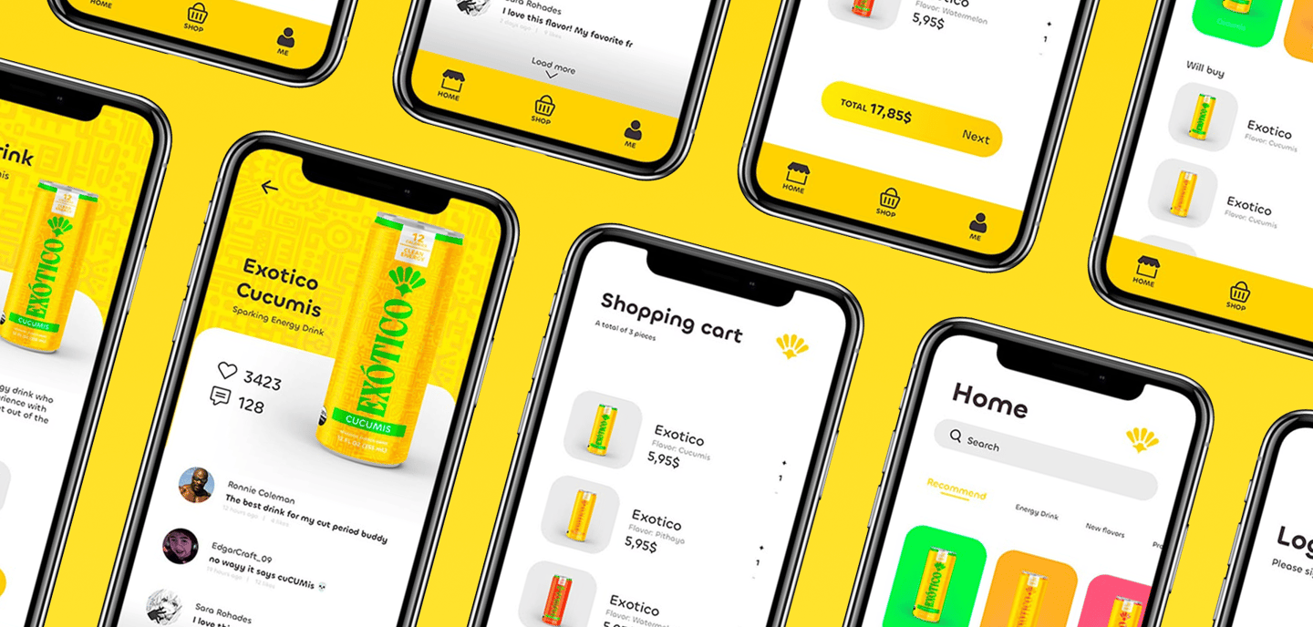
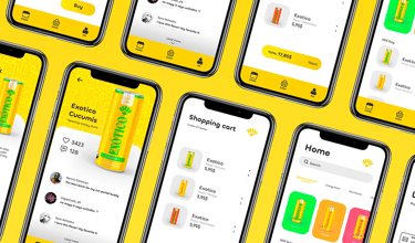
MOBILE APP
The Exòtic mobile app was designed as a high-fidelity prototype from the start, focusing on a visually engaging experience rather than traditional wireframes. It functions as an e-commerce platform for the drinks while extending the brand’s vibrant and playful identity into the digital space. The interface uses bold colors, organic shapes, and clear typography to create a simple, intuitive, and enjoyable shopping experience, reflecting the same energy and creativity found in the packaging and overall brand ecosystem.


CONCLUSION
Results
The Exòtic project successfully unified branding, packaging, and digital experience into a cohesive ecosystem. The visual identity, bold logo, vibrant cans, and high-fidelity app all reflect the brand’s playful, adventurous, and creative personality. Each flavor is instantly recognizable while maintaining a consistent look, helping the product stand out and connect with its target audience.
Learnings
Through this project, I gained valuable insights into designing an integrated brand experience across multiple touchpoints. I learned how visual identity, packaging, and digital interfaces can work together to create emotional engagement, and how simplicity, consistency, and careful use of color and shapes can strengthen a brand’s personality and memorability.